Black house details
- The house accommodates 4 adults.
- The home is fully furnished and includes e.g. 2 small refrigerators, a dish-washer, washing machine and a dryer, TV, DVD player, Wi-Fi, vacuum cleaner and a hair-dryer.
- Linens, towels and bathrobes are provided.
- Spacious bathroom with shower and a bathtub.
- Fully equipped kitchen.
- Nespresso coffee machine, a milk-frother and some coffee capsules are provided.
- In the cabinet you should also find a French coffee press, cream whisker, pots and pans.
- You are welcome to use all spices, oils, coffee and other things that you can find in the kitchen for your cooking.
- Extra supplies of candles, light bulbs, kitchen paper etc.
Barn house details
- The house accommodates up to 4 adults.
- The home is fully furnished and includes e.g. 1 small and 1 full size refrigerators, a combined stove and dish-washer, washing machine and a dryer, smart TV, Wi-Fi, vacuum cleaner and a hair-dryer.
- Linens, towels and bathrobes are provided.
- One bathroom with shower.
- Geothermal outdoor wooden hot tub.
- Fully equipped kitchen.
- Nespresso coffee machine with 10 complimentary capsules.
- In the cabinet you should also find a French coffee press, cream whisker, pots and pans.
- You are welcome to use all spices, oils, coffee and other things that you can find in the kitchen for your cooking.
- Extra supplies of candles, light bulbs, kitchen paper etc.
Boutique apartment details
- The apartment accommodates up to 4 adults.
- The home is fully furnished and includes e.g. SMEG refrigerator, dish-washer, washing machine and a dryer, TV, DVD, Wi-Fi, vacuum cleaner and a hair-dryer.
- Linens, towels and bathrobes are provided.
- One bathroom with shower.
- Free standing bathtub in master bedroom.
- Fully equipped kitchen.
- Nespresso coffee machine, a milk-frother and some coffee capsules are provided.
- In the cabinet you should also find a French coffee press, cream whisker, pots and pans.
- You are welcome to use all spices, oils, coffee and other things that you can find in the kitchen for your cooking.
- Extra supplies of candles, light bulbs, kitchen paper etc.
Nine boutique apartments in Hveragerði
INNI - Boutique apartments - is located in the geothermal town Hveragerði, only 45 km from Reykjavik and in great location to explore the many of the main attraction in Iceland. The apartments are tastefully decorated and with a fully equipped kitchen. All guests have access to an outdoor spa area with a hot tub & steam bath.
At Inni guests can choose between five one bedroom apartments, two studios and two 2 bedrooms apartments.
One bedroom apartments: Five comfortable and spacious apartments for 2 guests. The apartments no. 5-9 at INNI are 40 m2 with one bedroom, an open kitchen and living room. The kitchen is fully equipped with a stove top, microwave, Nespresso coffee machine, toaster and more. You will also find all main staples for cooking, like cooking oil, basic spices, vinegar etc. The bedroom can either be made up with a double bed or as 2 single beds.
Studio apartments - The apartments at INNI no. 3 and 4 are comfortable and spacious 45 m2 studios for 2 guests. The kitchen is fully equipped with a stove top, oven, Nespresso coffee machine, toaster and more. You will also find all main staples for cooking, like cooking oil, basic spices, vinegar etc. The bedroom can either be made up with a double bed or as 2 single beds.
Two bedroom apartments - The apartments at INNI no. 1 and 2 are comfortable and spacious (65 m2) for up to 4 guests. The kitchen is fully equipped with a stove top, oven, Nespresso coffee machine, toaster and more. You will also find all main staples for cooking, like cooking oil, basic spices, vinegar etc. The bedroom can either be made up with a double or single beds.
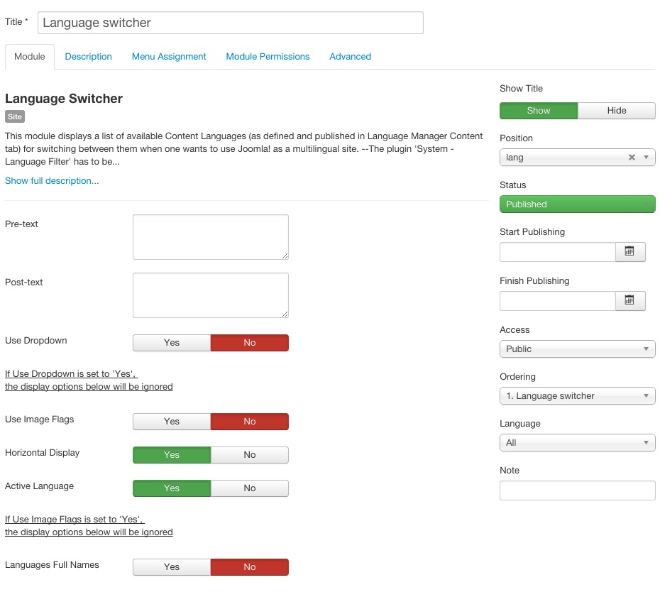
Language switcher
This language switcher was created for demo purpose only. We didn't implemented this feature in the quickstart in order to preserve users from removing big amount of an unnecessary content, menu items etc.
If you wan to create a language switcher as in demo, please create a new instance of Language switcher module, place it at the lang module position and configure it as below:
PhotoSwipe configuration
The Hotel template contains support for the PhotoSwipe gallery.
Demo gallery is available here.
In order to create the gallery, you will need to use a special structure based on the gk-cols structure enhanced by few elements:
<div class="gk-cols gk-gallery" data-cols="3">
<div>
CONTENT OF THE FIRST COLUMN
</div>
<div>
CONTENT OF THE SECOND COLUMN
</div>
<div>
CONTENT OF THE THIRD COLUMN
</div>
</div>
In the above code the structure of the gk-cols is different due adding additional CSS class - gk-gallery. This class is necessary for the PhotoSwipe script.
The content of the columns is generated by adding following links:
<a
   href="/images/demo/gallery/image1.jpg"
   data-size="1280x1280"
   data-title="Modern clock"
   data-desc="Lorem ipsum dolor sit amet, consectetur adipiscing elit. Proin consectetur dui at tempor elementum. Aenean convallis metus nec nibh varius hendrerit."
>
   <img src="/images/demo/gallery/thumb1.jpg" alt="Thumbnail I" />
</a>
Every link contains few important elements:
- Url to the full image in the href attribute.
- Thumbnail image as the img tag inside the link.
- Dimensions of the full image in the data-size attribute of the link.
- Title of the slide (optional) as the data-title attribute of the link.
- Description of the slide (optional) as the data-desc attribute of the link.
Full gallery code is visible below:
<div class="gk-cols gk-gallery" data-cols="3">
<div>
<a href="/images/demo/gallery/image1.jpg" data-size="1280x1280" data-title="Modern clock" data-desc="Lorem ipsum dolor sit amet, consectetur adipiscing elit. Proin consectetur dui at tempor elementum. Aenean convallis metus nec nibh varius hendrerit."><img src="/images/demo/gallery/thumb1.jpg" alt="Thumbnail I" /></a>
<a href="/images/demo/gallery/image2.jpg" data-size="1280x853" data-title="Painting love" data-desc="Lorem ipsum dolor sit amet, consectetur adipiscing elit. Proin consectetur dui at tempor elementum. Aenean convallis metus nec nibh varius hendrerit."><img src="/images/demo/gallery/thumb2.jpg" alt="Thumbnail II" /></a>
<a href="/images/demo/gallery/image3.jpg" data-size="1164x872" data-title="Green Barrel" data-desc="Lorem ipsum dolor sit amet, consectetur adipiscing elit. Proin consectetur dui at tempor elementum. Aenean convallis metus nec nibh varius hendrerit."><img src="/images/demo/gallery/thumb3.jpg" alt="Thumbnail III" /></a>
<a href="/images/demo/gallery/image4.jpg" data-size="1280x853" data-title="Wooden doors" data-desc="Lorem ipsum dolor sit amet, consectetur adipiscing elit. Proin consectetur dui at tempor elementum. Aenean convallis metus nec nibh varius hendrerit."><img src="/images/demo/gallery/thumb4.jpg" alt="Thumbnail IV" /></a>
<a href="/images/demo/gallery/image5.jpg" data-size="852x1280" data-title="Japanese dinner" data-desc="Lorem ipsum dolor sit amet, consectetur adipiscing elit. Proin consectetur dui at tempor elementum. Aenean convallis metus nec nibh varius hendrerit."><img src="/images/demo/gallery/thumb5.jpg" alt="Thumbnail V" /></a>
</div>
<div>
<a href="/images/demo/gallery/image6.jpg" data-size="853x1280" data-title="Photography art" data-desc="Lorem ipsum dolor sit amet, consectetur adipiscing elit. Proin consectetur dui at tempor elementum. Aenean convallis metus nec nibh varius hendrerit."><img src="/images/demo/gallery/thumb6.jpg" alt="Thumbnail VI" /></a>
<a href="/images/demo/gallery/image7.jpg" data-size="1280x853" data-title="Sailing in the fog" data-desc="Lorem ipsum dolor sit amet, consectetur adipiscing elit. Proin consectetur dui at tempor elementum. Aenean convallis metus nec nibh varius hendrerit."><img src="/images/demo/gallery/thumb7.jpg" alt="Thumbnail VII" /></a>
<a href="/images/demo/gallery/image8.jpg" data-size="1280x853" data-title="Travel time" data-desc="Lorem ipsum dolor sit amet, consectetur adipiscing elit. Proin consectetur dui at tempor elementum. Aenean convallis metus nec nibh varius hendrerit."><img src="/images/demo/gallery/thumb8.jpg" alt="Thumbnail VIII" /></a>
<a href="/images/demo/gallery/image9.jpg" data-size="960x1280" data-title="For ged" data-desc="Lorem ipsum dolor sit amet, consectetur adipiscing elit. Proin consectetur dui at tempor elementum. Aenean convallis metus nec nibh varius hendrerit."><img src="/images/demo/gallery/thumb9.jpg" alt="Thumbnail IX" /></a>
<a href="/images/demo/gallery/image10.jpg" data-size="1280x853" data-title="Summer time" data-desc="Lorem ipsum dolor sit amet, consectetur adipiscing elit. Proin consectetur dui at tempor elementum. Aenean convallis metus nec nibh varius hendrerit."><img src="/images/demo/gallery/thumb10.jpg" alt="Thumbnail X" /></a>
</div>
<div>
<a href="/images/demo/gallery/image11.jpg" data-size="1280x853" data-title="Mobile music" data-desc="Lorem ipsum dolor sit amet, consectetur adipiscing elit. Proin consectetur dui at tempor elementum. Aenean convallis metus nec nibh varius hendrerit."><img src="/images/demo/gallery/thumb11.jpg" alt="Thumbnail XI" /></a>
<a href="/images/demo/gallery/image12.jpg" data-size="1155x1280" data-title="Guitar artist" data-desc="Lorem ipsum dolor sit amet, consectetur adipiscing elit. Proin consectetur dui at tempor elementum. Aenean convallis metus nec nibh varius hendrerit."><img src="/images/demo/gallery/thumb12.jpg" alt="Thumbnail XII" /></a>
<a href="/images/demo/gallery/image13.jpg" data-size="873x1280" data-title="Typewriter" data-desc="Lorem ipsum dolor sit amet, consectetur adipiscing elit. Proin consectetur dui at tempor elementum. Aenean convallis metus nec nibh varius hendrerit."><img src="/images/demo/gallery/thumb13.jpg" alt="Thumbnail XIII" /></a>
<a href="/images/demo/gallery/image14.jpg" data-size="1280x853" data-title="Morning coffee" data-desc="Lorem ipsum dolor sit amet, consectetur adipiscing elit. Proin consectetur dui at tempor elementum. Aenean convallis metus nec nibh varius hendrerit."><img src="/images/demo/gallery/thumb14.jpg" alt="Thumbnail XIV" /></a>
<a href="/images/demo/gallery/image15.jpg" data-size="1280x848" data-title="Fitness time" data-desc="Lorem ipsum dolor sit amet, consectetur adipiscing elit. Proin consectetur dui at tempor elementum. Aenean convallis metus nec nibh varius hendrerit."><img src="/images/demo/gallery/thumb15.jpg" alt="Thumbnail XV" /></a>
</div>
</div>
Enabling the animations
As default the animations and transitions are disabled due fact that images have different proportions as thumbnails and as full images. But if you have a similar proportions on the thumbnails and full images you can activate the animations again.
In the js/gk.scripts.js file please uncomment the following lines:
showHideOpacity: true,
hideAnimationDuration: 0,
showAnimationDuration: 0,
Gallery Showcase
This item was created only for creating a menu item purpose.
Additional typography elements
This article describes additional elements used for creating a demo content for the Hotel template.
Hotel informations block
The hotel informations are based on the following HTML structure:
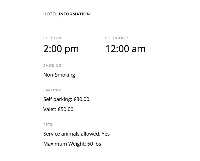
<ul class="gk-info">
<li class="gk-info-col-2">
<dl>
<dt>Check-in:</dt>
<dd><strong>2:00 pm</strong></dd>
</dl>
</li>
<li>
<dl class="gk-info-col-2">
<dt>Check-out:</dt>
<dd><strong>12:00 am</strong></dd>
</dl>
</li>
<li>
<dl>
<dt>Smoking:</dt>
<dd>Non-Smoking</dd>
</dl>
</li>
<li>
<dl>
<dt>Parking:</dt>
<dd>Self parking: €30.00</dd>
<dd>Valet: €50.00</dd>
</dl>
</li>
<li>
<dl>
<dt>Pets:</dt>
<dd>Service animals allowed: Yes</dd>
<dd>Maximum Weight: 50 lbs</dd>
</dl>
</li>
</ul>
Photo grids
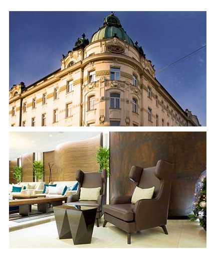
Blocks with photos uses a photo grid structure:
<div class="gk-photo-grid no-margin">
<figure class="gk-grid-1" data-sr="scale up 10%">
<img src="/images/demo/hotel1.jpg" alt="" />
</figure>
<figure class="gk-grid-1" data-sr="scale up 10% and wait 0.15s">
<img src="/images/demo/hotel2.jpg" alt="" />
</figure>
</div>
Other example of the photo grid:
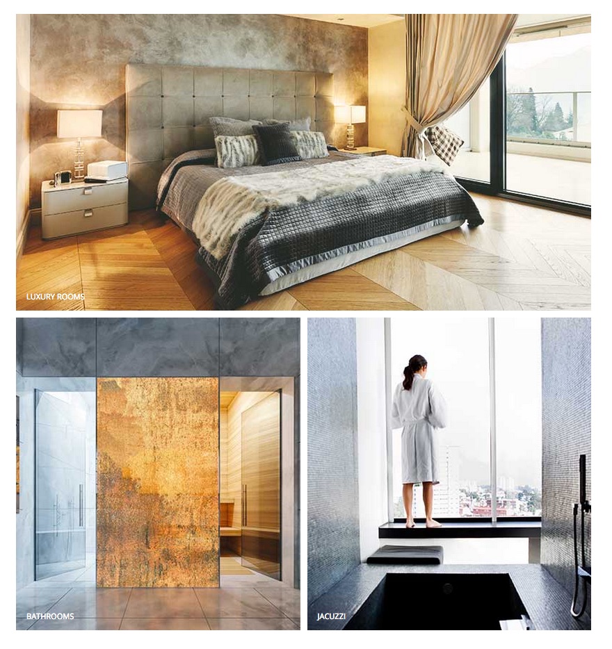
<div class="gk-photo-grid offset-left">
<figure class="gk-grid-1" data-sr="scale up 10%">
<img src="/images/demo/hotel3.jpg" alt="" />
<figcaption>Luxury rooms</figcaption>
</figure>

<figure class="gk-grid-2" data-sr="scale up 10% and wait .15s">
<img src="/images/demo/hotel5.jpg" alt="" />
<figcaption>Bathrooms</figcaption>
</figure>

<figure class="gk-grid-2" data-sr="scale up 10% and wait .3s">
<img src="/images/demo/hotel4.jpg" alt="" />
<figcaption>Jacuzzi</figcaption>
</figure>
</div>
Above example uses also the offset-left class which creates a negative left margin.
Newsletter popup
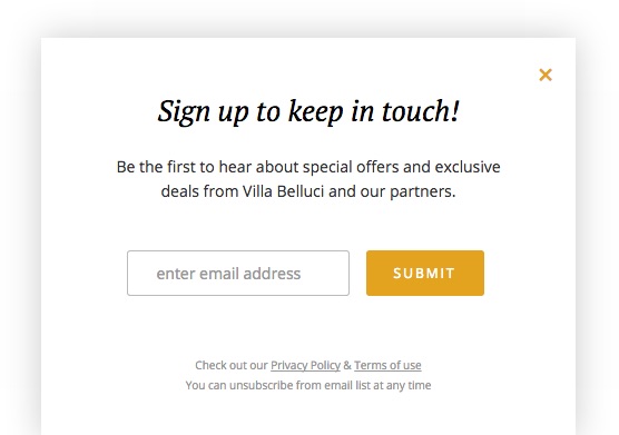
Newsletter popup is a Custom HTML module which uses the following code:
<h3>
     Sign up to keep in touch!
</h3>
<p>
     Be the first to hear about special offers and exclusive deals from Villa Belluci and our partners.
</p>
<form action="index.php?option=com_acymailing&ctrl=sub" method="post">
     <input type="email" required  id="user_email" name="user[email]" placeholder="enter email address">
     <input type="submit" value="Submit" id="gk-newsletter-submit">
     <input type="hidden" name="acyformname" value="formAcymailing1" />
     <input type="hidden" name="ctrl" value="sub"/>
     <input type="hidden" name="task" value="optin"/>
     <input type="hidden" name="option" value="com_acymailing"/>
     <input type="hidden" name="visiblelists" value=""/>
     <input type="hidden" name="hiddenlists" value="1"/>
     <input type="hidden" name="user[html]" value="1"/>
</form>
<!-- Configuration details: https://www.acyba.com/acymailing/248-acymailing-external-subscription-form.html -->

<small> Check out our <a href="#">Privacy Policy</a> & <a href="#">Terms of use</a><br />
You can unsubscribe from email list at any time </small>
Footer links
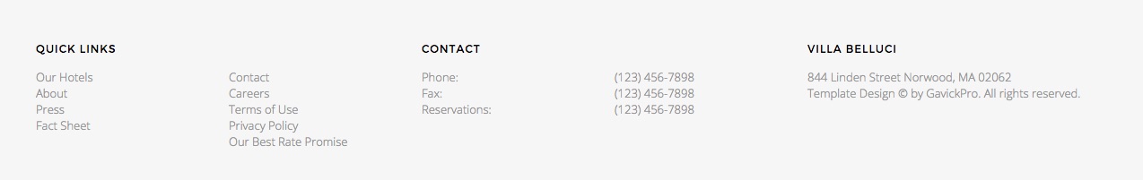
Links at the footer are based on the following HTML structure
<div class="gk-cols" data-cols="3">
    <div>
        <h3>Quick Links</h3>
        <div class="gk-cols" data-cols="2">
            <div>
                <ul>
                    <li><a href="#">Our Hotels</a></li>
                    <li><a href="#">About</a></li>
                    <li><a href="#">Press</a></li>
                    <li><a href="#">Fact Sheet</a></li>
                </ul>
            </div>

            <div>
                <ul>
                    <li><a href="#">Contact</a></li>
                    <li><a href="#">Careers</a></li>
                    <li><a href="#">Terms of Use</a></li>
                    <li><a href="#">Privacy Policy</a></li>
                    <li><a href="#">Our Best Rate Promise</a></li>
                </ul>
            </div>
       </div>
    </div>

    <div>
        <h3>Contact</h3>
        <div class="gk-cols" data-cols="2">
            <div>
                <p>Phone:</p>
                <p>Fax:</p>
                <p>Reservations:</p>
            </div>

            <div>
                <p>(123) 456-7898</p>
                <p>(123) 456-7898</p>
                <p>(123) 456-7898</p>
            </div>
       </div>
    </div>

    <div>
        <h3>Villa Belluci</h3>
        <p>844 Linden Street Norwood, MA 02062</p>
        <p>Template Design © by <a href="https://www.gavick.com/" title="GavickPro" rel="nofollow">GavickPro</a>. All rights reserved.</p>
    </div>
</div>
Footer social links
The social icons at the footer uses the following code:
<ul class="gk-social-links">
<li><a href="#"><i class="gk-icon-twitter"></i></a></li>
<li><a href="#"><i class="gk-icon-fb"></i></a></li>
<li><a href="#"><i class="gk-icon-gplus"></i></a></li>
<li><a href="#"><i class="gk-icon-linkedin"></i></a></li>
<li><a href="#"><i class="gk-icon-pinterest"></i></a></li>
</ul>